We use cookies to make your experience better. To comply with the new e-Privacy directive, we need to ask for your consent to set the cookies. Learn more.

Colour Psychology and its Impact in Interior Design
“Colour is a power which directly influences the soul." – Wassily Kandinsky
True luxury transcends mere aesthetics; it's about creating spaces that resonate with your emotions and elevate your everyday experiences. At the House of Things, we often explore the fascinating realm of colour psychology and its profound impact on interior design. Join us as we dig deeper into the art of colour and design, and learn how to transform your home into a sanctuary of beauty and mindfulness.
The Subtle Science of Shade: Decoding Colour Psychology
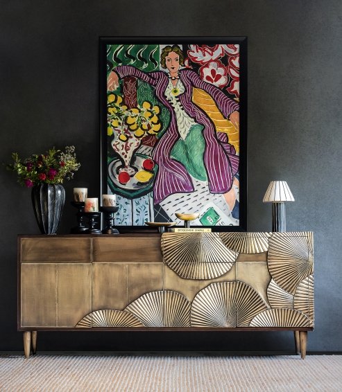
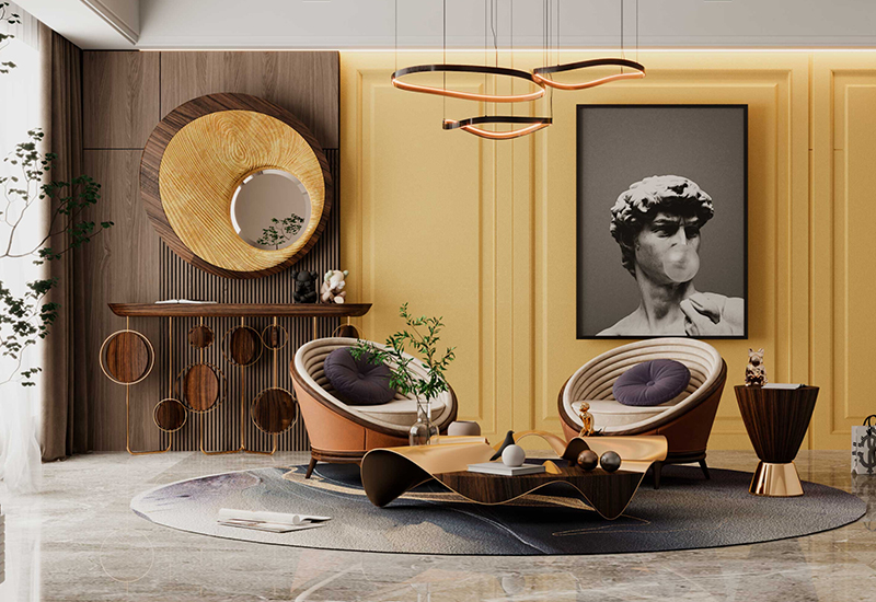
Designer: Peter Mikic, Project: Islington, London Image Source: Luxdeco.com
Colour psychology delves into the profound impact of hues on our emotions, perceptions, and overall mental state. Beyond their aesthetic appeal, colours are crucial in influencing our daily lives. By discerning these subtle nuances, we can transform our home interiors into sanctuaries that epitomise our aesthetic sensibilities and enhance our well-being, achieving an exquisite synthesis of elegance and comfort.
A Guide to Master Interior Design Through Colour Psychology
Integrating the principles of colour psychology into interior design allows the creation of spaces that are not only aesthetically pleasing but also emotionally resonant.
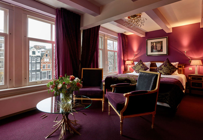
Project: Ambassade Hotel, Amsterdam Image Source: Hotels.com
When designing a space, consider the emotional response you wish to evoke. For instance, incorporating shades of blue in a bedroom can foster a sense of tranquillity and restful sleep, while vibrant reds in a dining room can stimulate conversation and appetite. Yellow, with its cheerful and uplifting qualities, can be used in kitchens or play areas to create an inviting and energetic atmosphere.
Designer: Alma De Luce, Project: Yellow Colour for entryway. Image Source: Alma De Luce Website
Beyond individual colours, the balance and combination of hues play a critical role in achieving a harmonious home interior design. Neutral tones such as beige, grey, and white can serve as a sophisticated backdrop that highlights accent colours, bringing a sense of timeless elegance to the space. Meanwhile, integrating contrasting colours can add dynamism and depth, making the design more engaging.
Texture and material also interact with colour to enhance the overall feel of a room. Rich, plush fabrics in deep colours can create a sense of luxury and comfort, while sleek, glossy surfaces in lighter tones can contribute to a modern, airy ambiance.
Bold and Beautiful: Top 5 Vibrant Interiors Around the Globe
In the world of hospitality, vibrant interiors are more than just a design choice—they are an invitation to experience the extraordinary. Here, we highlight some of the most stunning examples of vibrant interiors, showcasing how thoughtful use of colour can transform spaces and elevate the guest experience.
Hotel: Semiramis Hotel, Athens
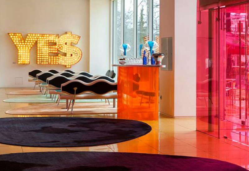
Designer: Karim Rashid, Project: Semiramis Hotel, Athens. Image Source: Kiwicollection.com
Designed by the iconic Karim Rashid, the Semiramis Hotel in Athens dazzles with its vibrant hues and bold, contemporary design. Each space, from the vivid lobby to the playful rooms,
creates a dynamic and inspiring atmosphere for guests to enjoy.
Villa Paladio, Jaipur
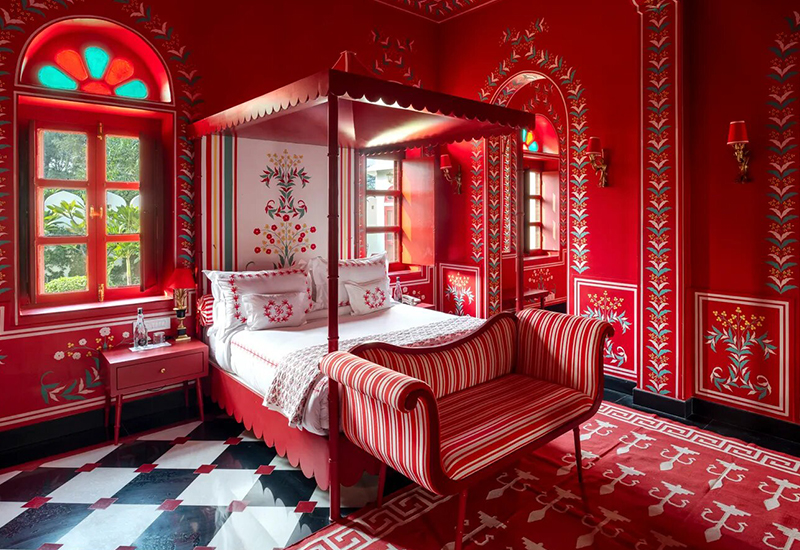
Designer: Mary anne Oudejans, Project: Villa Paladio, Jaipur. Image Source: villa-paladio-jaipur.com
Villa Palladio in Jaipur, designed by Mary Anne Oudejans, enchants visitors with its rich, vibrant interiors inspired by Mughal architecture and Italian design. The lavish use of deep reds and striking whites, combined with intricate patterns and luxurious textiles, creates an atmosphere of timeless elegance and cultural fusion.
Hotel Pullman Berlin Schweizerhof,Germany

Designer: Sundukovy Sisters Project: Hotel Pullman Berlin Schweizerhof,Germany. Image Source: booking.com
Hotel Pullman Berlin Schweizerhof, designed by Sundukovy Sisters, exudes modern sophistication with its palette of refined neutrals with pops of vibrant colours, every corner of this hotel invites guests into a world of stylish comfort and cosmopolitan charm.
Chez Nina, Milano
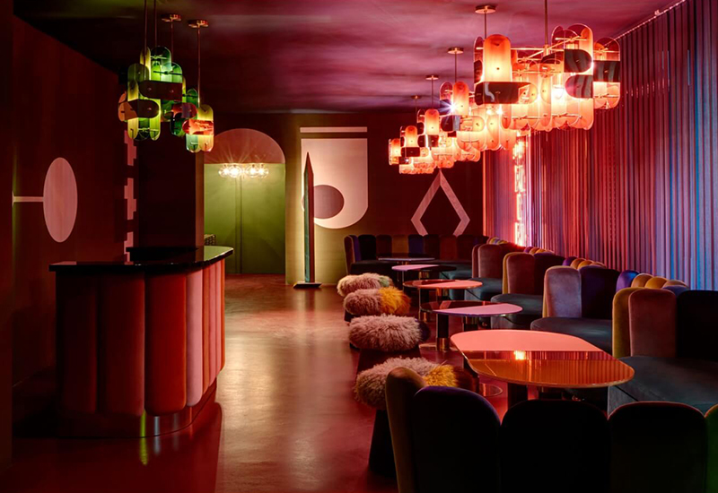
Designer: India Mahdavi, Project: Chez Nina, Milano. Image Source: india-mahdavi.com
One of India Mahdavi’s most iconic projects, Chez Nina, perfectly encapsulates her vibrant vision. Located in the heart of Paris, this eclectic and stylish venue is a tribute to bold colour and innovative design. The interiors feature a harmonious mix of vivid pinks, lush greens, and striking blues, all seamlessly integrated into a chic and cohesive space.
Houtique Maison Et Object 2019

Designer: Masquespacio, Project: Houtique Maison Et Object 2019. Image Source: masquespacio.com
The fair booth designed by Masquespacio, for Houtique Maison Et Objet 2019, seeks to immerse the visitors in Houtique’s lux and fun world. The space is adorned with an array of purple hues, from deep amethyst to soft lavender, creating a visually stunning and cohesive environment. The sleek furnishings and luxurious textures enhance the contemporary elegance, making it a bold and sophisticated showcase of vibrant design.
The Art of Colour: Insights from Maria Lozano
Maria Lozano,a spanish designer renowned for her distinctive design ethos, infuses spaces with vibrant hues that resonate with energy and sophistication. Her collaboration with The House of Things, culminated in Chroma Casa, a collection that reflects her vision of luxury intertwined with bold, expressive colour. This creative fusion draws inspiration from an imagined journey taken by Mexican architect Luis Barragán to India.

Chroma Casa features an eye-popping riot of chromatic contrast, from playful furniture staples to iridescent glassware and vibrant home linen. The collection offers something for everyone who loves a pop of colour, embodying a harmonious balance of vibrancy and elegance. A palette packed with Pantones—royal blues, sunshine yellows, sizzling reds, and warm pinks—creates an artful vocabulary inspired by the cultural fusion of Mexico and India.
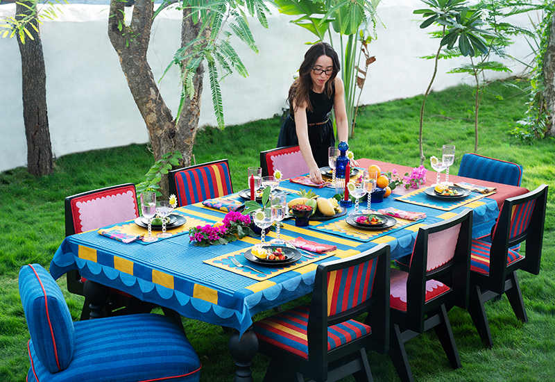
For Lozano, Chroma Casa represents more than just furniture; it is a testament to the power of colour to shape atmospheres and elevate experiences. By embracing a spectrum of shades, she aimed to offer clients a diverse palette to express their individuality and enhance their living environments. The collection's bold yet refined aesthetic underscores her belief that luxury lies not only in material quality but also in the emotional impact of design.

Embracing the Power of Colour in Design

A 20 year old villa in Goa, redesigned by Eshita Marwah. Image Source: designpataki.com
The influence of colour on our emotions and surroundings is undeniable.Whether it's the vibrant hues of renowned hospitality spaces or the insightful designs of Maria Lozano in Chroma Casa, embracing bold and dynamic colours can transform any space into a luxurious and harmonious haven. As you explore and incorporate these vibrant elements into your home interiors, remember that the true essence of design lies in the balance of beauty, comfort, and emotional resonance.